Color plays such a huge role in how we process the world around us.
It can shift our mood, shape our energy, and completely change how a space feels. Ever wonder why some rooms make you feel on edge while others feel soothing? More often than not… it’s the colors doing the talking.
As both a realtor and a designer, I see this every single day. Color influences how buyers experience a home, how homeowners feel in their space, and how we connect emotionally to the environments we live in.
I’m constantly inspired by the everyday—living life, noticing the details, and finding little ways to romanticize the small things. And when I look back through my camera roll, I can actually see the patterns: the palettes that move me, the tones that show up again and again, and the colors that most impact how we live.
So here’s a simple breakdown of basic color theory… told through the lens of design, real estate, and my own camera roll.
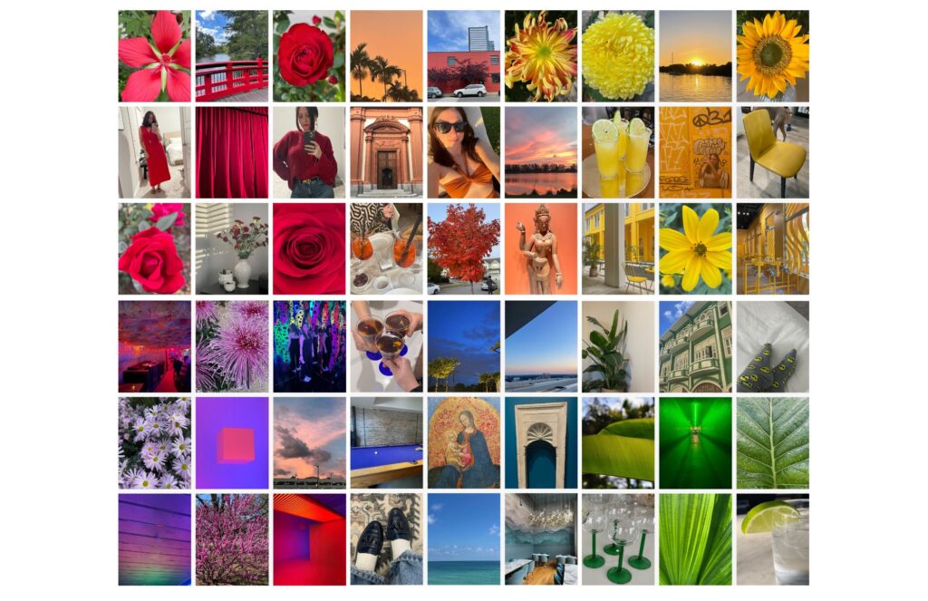
❤️ Red
Red is the color of the heart — representing attraction, vitality, and warmth. It’s not just about romance; it’s about the pulse of life itself. In interiors, red can spark energy, confidence, and bold emotion.
But it can also overwhelm. For that reason, I rarely decorate with true red unless it’s in the form of fresh flowers or an intentional focal point. Because red is intense, dramatic, and deeply emotional, a little goes a long way.
In culture and history, red is tied to power, passion, and sometimes danger — which is why it always makes a statement whether we want it to or not.
And personally? Red is my favorite color to wear when I’m feeling sexy, confident, or powerful.
In design:
Use sparingly. Think accents, art, flowers, or a single powerful moment.
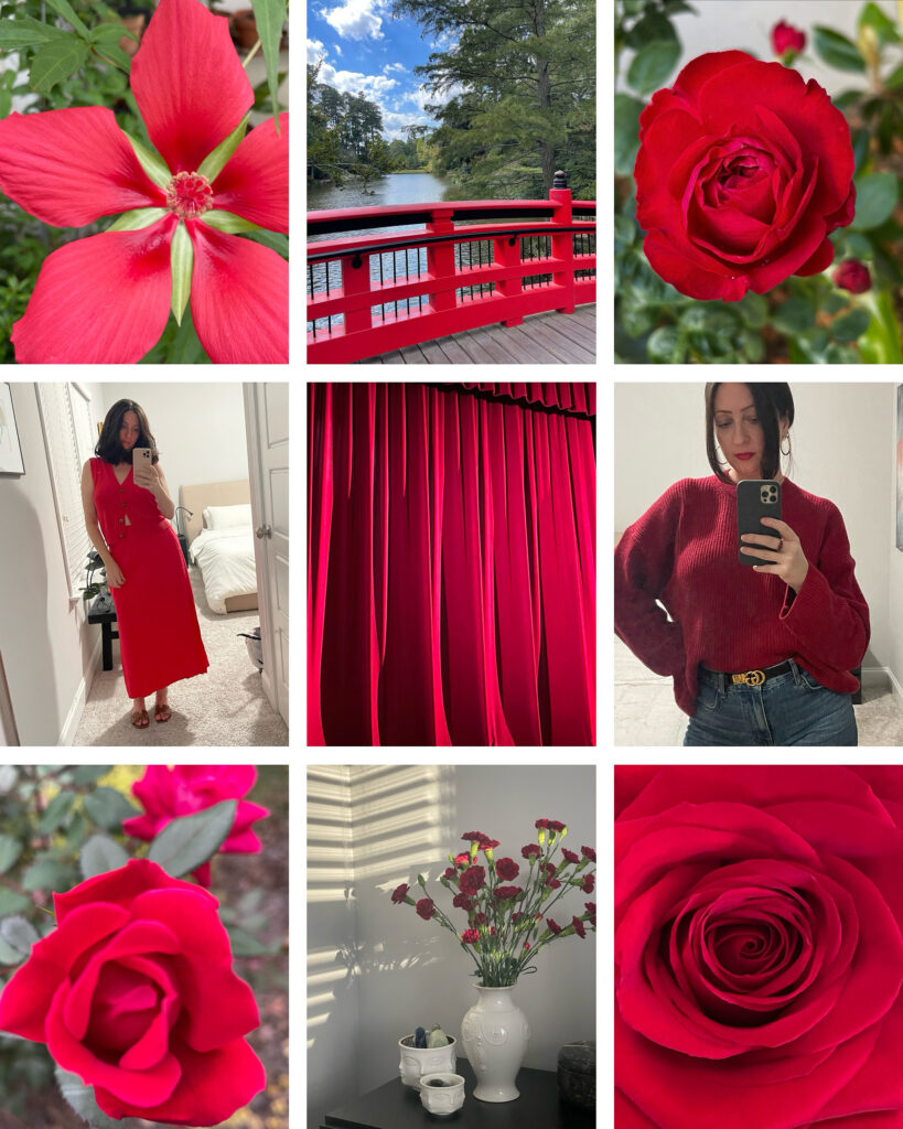
🧡 Orange
Orange feels warm, joyful, and alive — like a hug from the sun. It carries the intensity of red but softens it with the friendliness of yellow. It’s an uplifting color that naturally draws people together.
Orange evokes enthusiasm, confidence, and creativity. It inspires connection and expression, making it ideal for social spaces like kitchens, sunrooms, or creative offices.
When I photograph orange, it’s usually because it refuses to be ignored. I find it everywhere:
• Florida sunsets.
• North Carolina fall leaves, bright flowers, and warm fires.
• Museum ceilings and architectural details that feel regal.
• An Aperol spritz glowing against a crisp white tablecloth in Italy.
Orange is joy embodied.
In design:
Perfect for spaces where you want warmth, personality, and a sense of vibrancy.
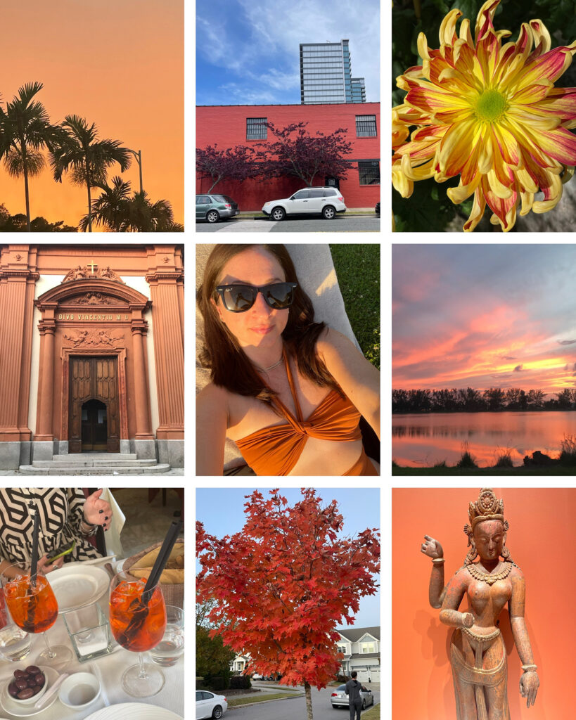
💛 Yellow
Yellow — the color of light and optimism. Yellow is frequently seen as a cheerful, joyful color that can uplift a mood.
It is associated with the mind, mental clarity, concentration, and creativity. In many cultures, it signifies hope, enlightenment, and change for the better. And due to its connection to the sun, yellow can represent warmth, energy, and vitality.
Yellow is a color I never wear or design with unless specifically requested by a client – I think it’s because I’m so easily overstimulated.
In design:
Use in moderation for kitchens, entryways, reading nooks, or anywhere you want an instant mood lift.
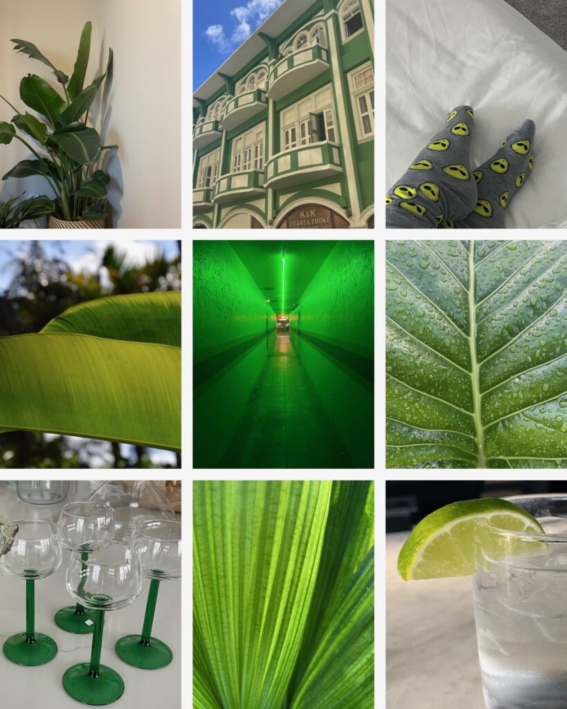
💚 Green
Green is known to be calming, and not just because it reminds us of nature, but because it’s the easiest color for the human eye to process, requiring no adjustment to see. It’s located in the middle of the visible light spectrum, which is why our eyes are most sensitive to it and it can have a restful effect on the nervous system, often associated with nature and balance.
Green is one of my favorite colors to wear, especially deep olives or forest greens. Like blue, I also consider it a neutral, and in interiors I mostly bring in the color with plants and/or artwork.
Fresh. Balanced. Restorative.
Green doesn’t demand attention — it restores it.
In design:
One of the best choices for bedrooms, bathrooms, and living spaces where you want calm and balance.
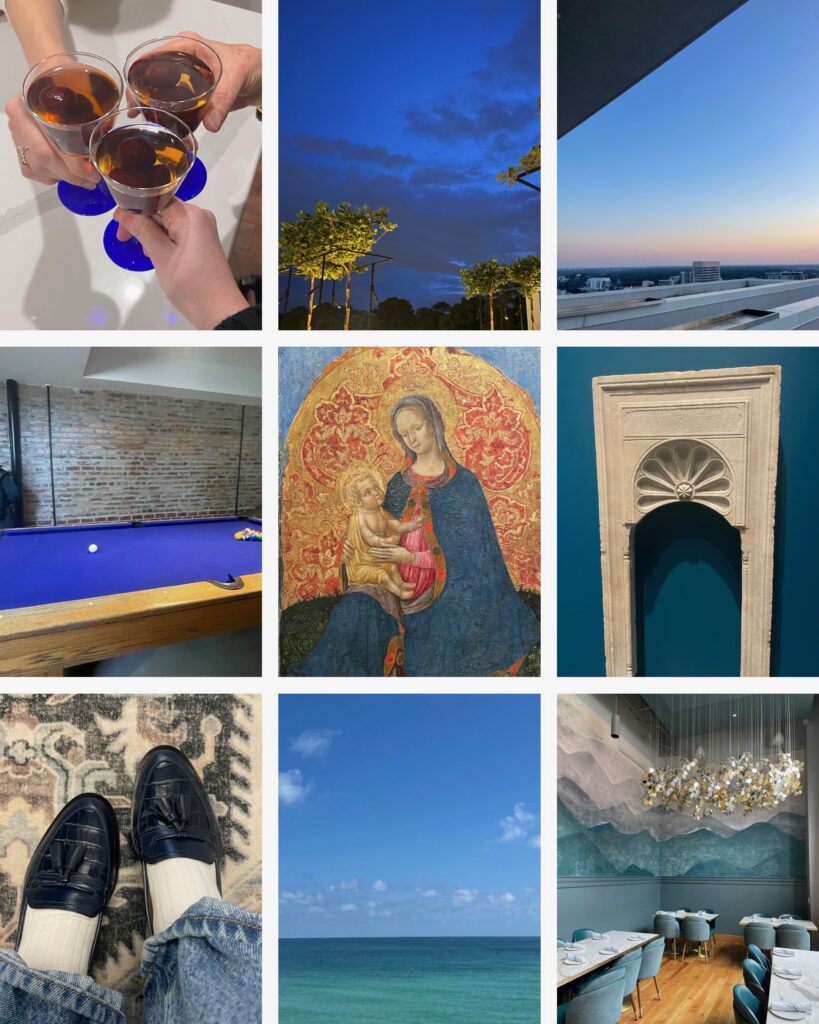
💙 Blue
Like the sky and ocean, blue naturally relaxes the mind and slows the heart rate. It offers peace, clarity, and a sense of openness — which is why it’s such a staple in home design.
Blue stimulates calm thinking, focus, and reflection. It represents the rational side of emotion: steady, collected, and cool.
Personally, blue is one of the few colors I decorate with and wear. Navy in particular shows up everywhere in my life — it’s colorful yet neutral, bold yet timeless.
Light blues feel airy and soothing.
Deep navies bring depth, strength, and trust.
Every shade whispers stability and peace.
In design:
Perfect for bedrooms, bathrooms, exterior paint, and timeless home palettes that appeal to buyers.
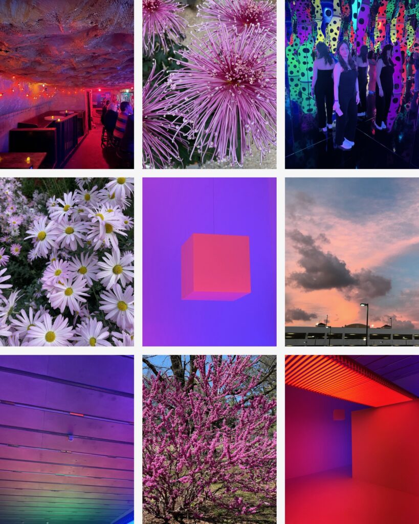
💜 Violet
Violet stimulates the imagination and inspires innovation. It’s the color artists, designers, and dreamers often love because it bridges intuition and intellect.
Historically tied to royalty, violet still carries a sense of richness — but to me, it also feels futuristic, creative, and a little bit mystical.
It has a quiet, otherworldly energy. It’s introspective, emotional, and connected to the unseen — the things we feel more than we see.
In design:
Best used as an accent or statement piece, especially in creative or meditative spaces.
Color isn’t just a visual experience — it’s an emotional one.
In both real estate and design, color sets the tone for how we live, how we connect, and how we feel in our spaces.
And sometimes? The best design inspiration comes straight from our camera rolls.
Whether you’re choosing a paint color, styling a room, or simply noticing the world around you, color is always there… shaping the story.
What colors speak the most to you? Let’s discuss your new home, listing your current one, or your home refresh.
Contact · Website · Instagram · Facebook


3 responses to “The Color Lab: Through My Camera Roll”
You have the best design eye. My idol!
And your my favorite person to work with 🙂
Your photographs are beautiful and I love your stories of all the colors.